Product Manual
Vita Load Navigator
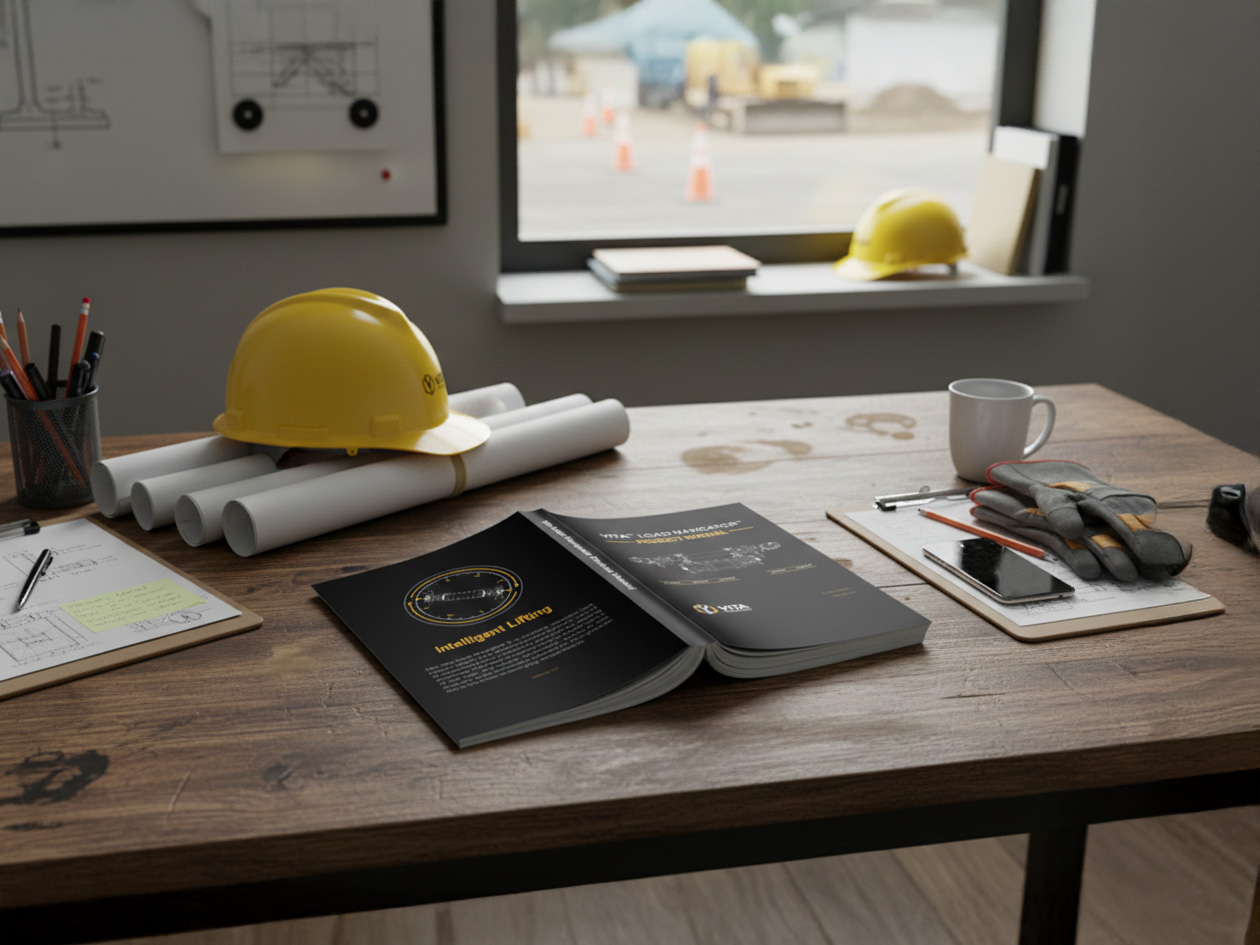
The Vita Load Navigator is a load monitoring system designed to provide real-time feedback on load conditions during hoisting operations. The product manual includes instructions for usage, assembly, and care of the Vita Load Navigator.
Vita Industrial
2021
Graphic Designer
Problem
The former product manual was set in Microsoft Word and had no visuals or indexes, making it difficult for users to follow. The presentation was lackluster: often times the manual was presented in the form of copy paper stapled together. Potential users, particularly the European audience, were not satisfied with the existing documentation. Sales engineers and salesmen frequently used the manual as a sales tool, but the lack of visuals and clarity made it difficult to explain the product to potential customers.
Solution
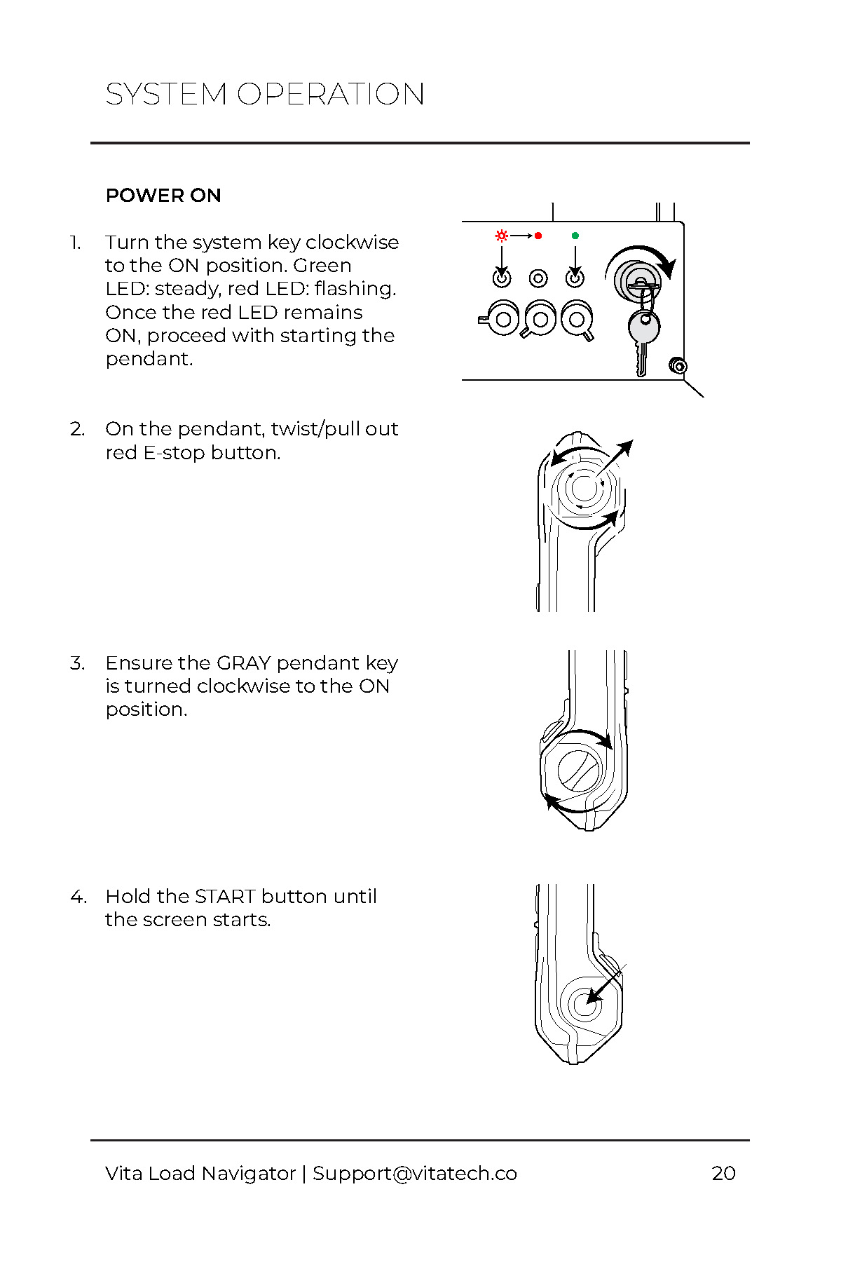
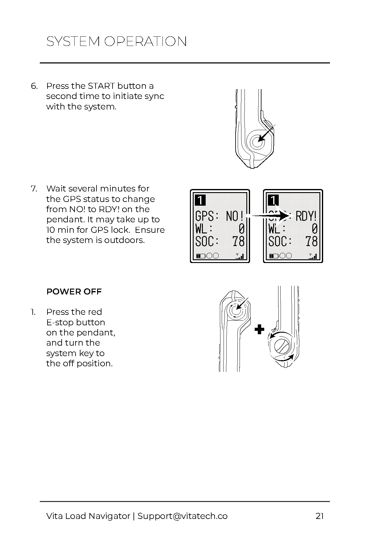
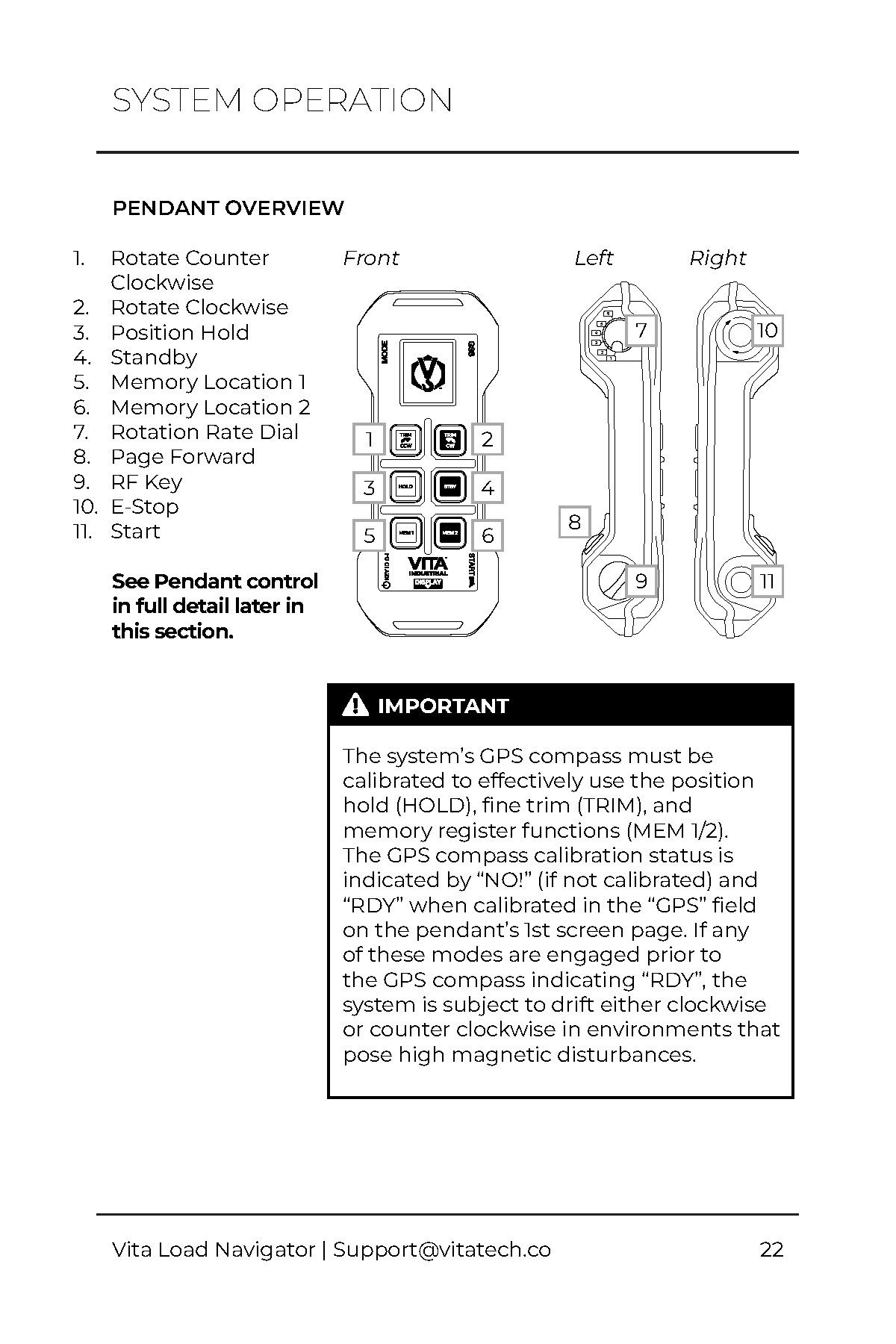
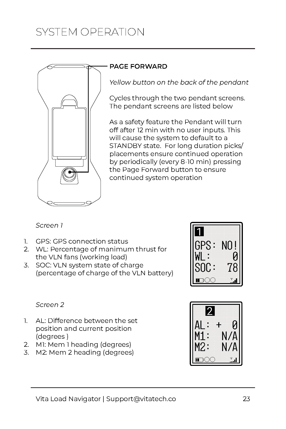
I worked closely with the Engineering team and CTO to deliver a visually appealing and user-friendly manual for both print and desktop. Graphics and content developed for the manual were also repurposed to create more sales oriented materials, such as brochures and spec sheets.
Steps
Research
I conducted research to understand the needs and frustrations of users and sales engineers with the current manual. This included field research with crane operators and riggers, as well as interviews with sales engineers.
Goals
Feedback from users and sales engineers was given to engineering teams regarding common frustrations with current documentation. Six core issues were identified.
Deliverable
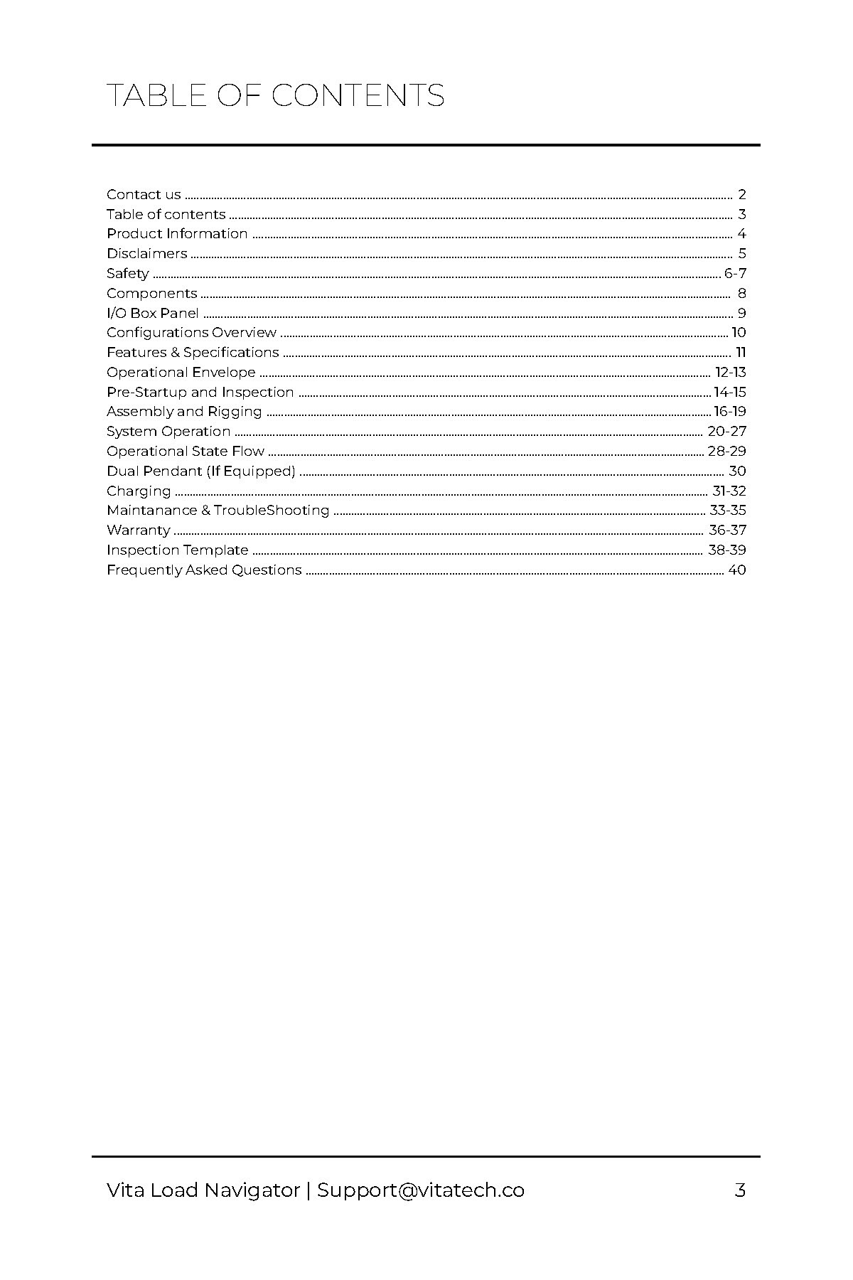
The new product manual received positive feedback internally and externally, with many noting that it was much easier to understand and navigate than the previous manual. The addition of visuals and a table of contents were particularly appreciated.
01
SkipResearch
Field Research
I conducted field research with crane operators and riggers to understand their needs and frustrations with the current manual.
"There are only a few pieces of content that are relevant to me... I have to shuffle through the entire thing to find what I'm looking for."
"The input box graphic is completely wrong."
"I want a birdseye view of the system to see how the pendant functions."
"We're really expected to pay a quarter million for this, and this is the documentation."
"The FAQ section is useful"
"The visuals are not clear at all... Line art would be much better."
"This manual is for the 20T system, we have the 40T."
"Some of the text is so small I can't even read it."
Questionnaire
A questionnaire was created to gather feedback from crane operators and riggers. Answers were collected on a scale of 1-5. The results shown here are the average of the responses.
- 1:
Strongly Disagree
- 2:
Disagree
- 3:
Neutral
- 4:
Agree
- 5:
Strongly Agree
Based on the survey, users found that the existing content and the order it was presented in adequate, but the lack of clear visuals and clarity made it difficult to understand the system. Users also found it difficult to find the information they needed in a timely manner, most likely due to the lack of an index and text hierarchy. Respondents concluded that a product manual is important for technical machinery.
-
A product manual is important for technical machinery
4.2 / 5
-
I feel confident in my ability to operate the Vita Load Navigator
4.1 / 5
-
I would trust the manual as a source of reference in the future
3.2 / 5
-
The structure and order of content is intuitive
3.0 / 5
-
I was able to find the answers to the questions I had by referencing the manual
2.4 / 5
-
I can quickly find the information I need
2.0 / 5
-
The visuals in the manual are helpful
1.4 / 5
02
SkipGoals
Feedback from users and sales engineers was given to engineering teams regarding common frustrations with current documentation. Six core issues were identified.
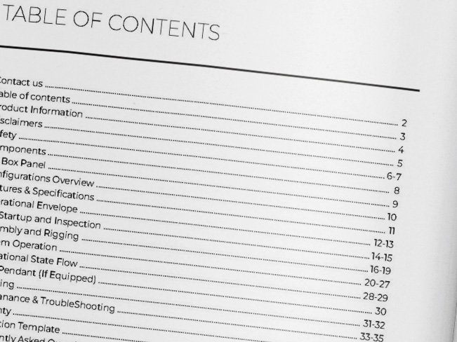
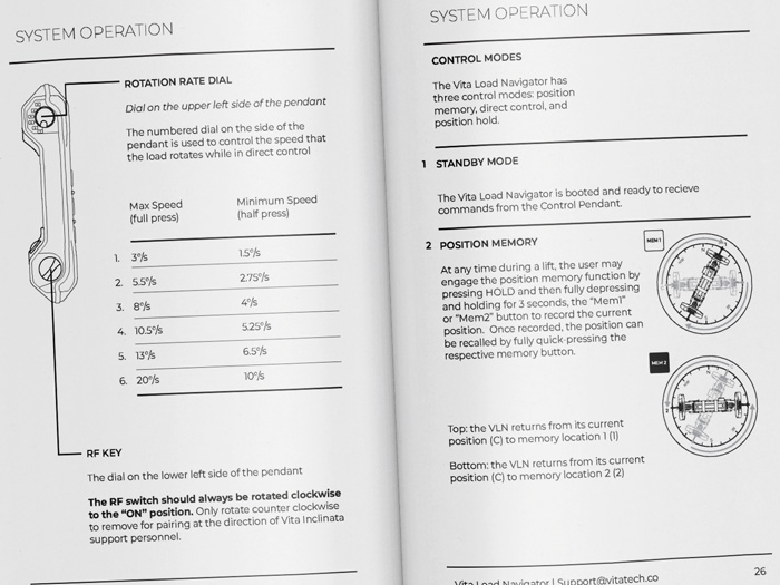
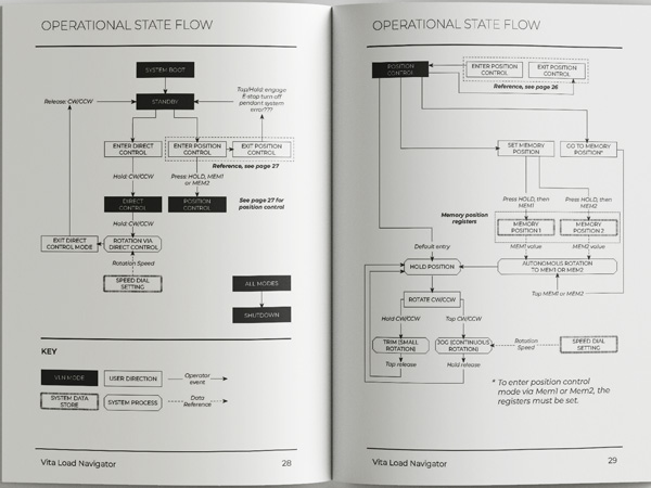
The following goals were identified, with example photographs addressing each one listed below.
| # | Issue | Goal |
|---|---|---|
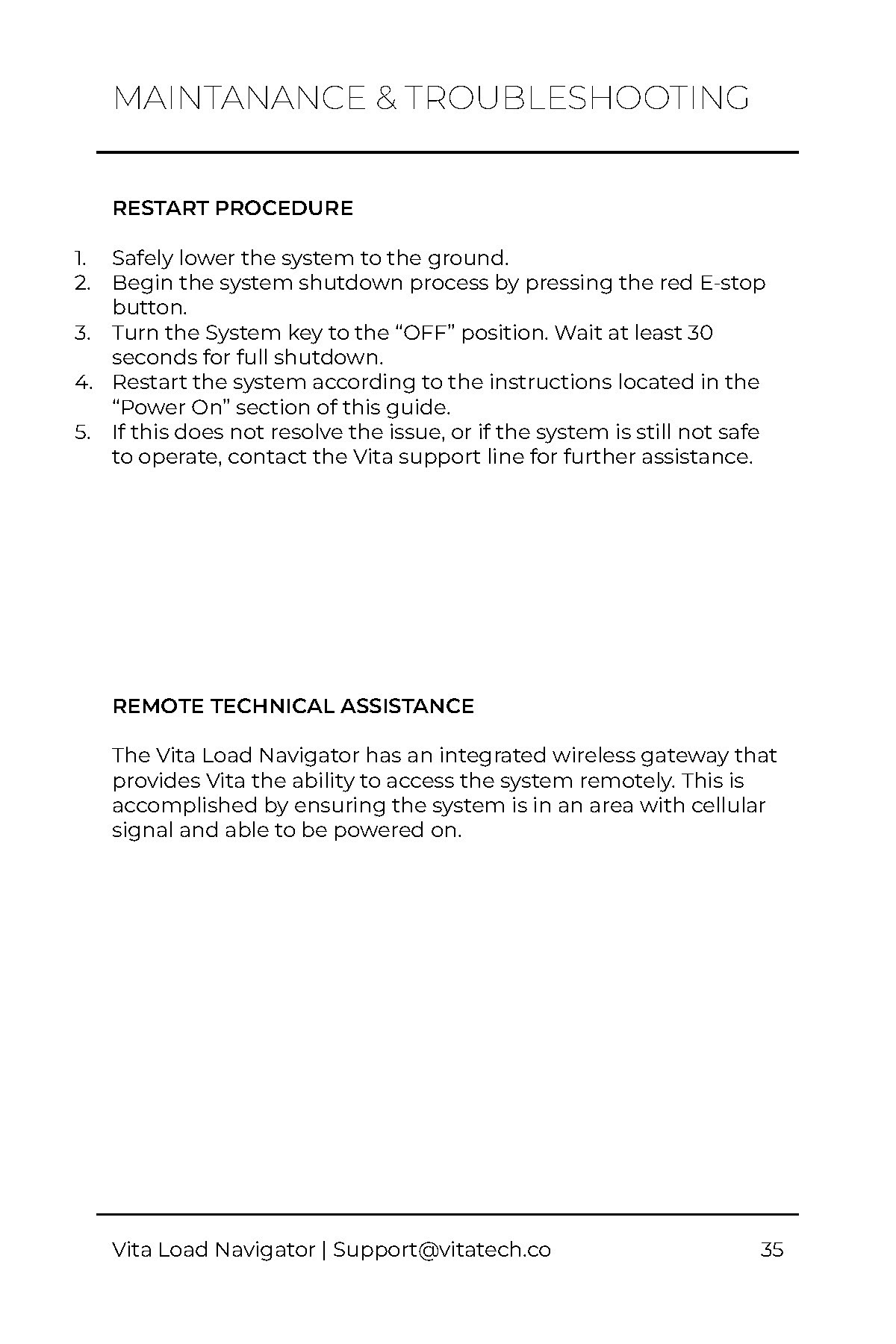
| 1 | There is no index for users to quickly navigate to the information they need. | Add a table of contents. |
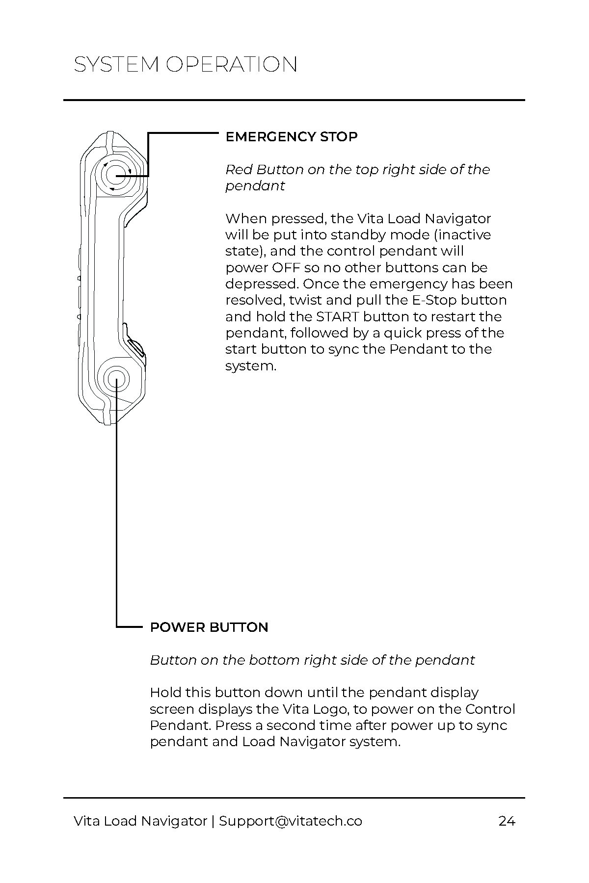
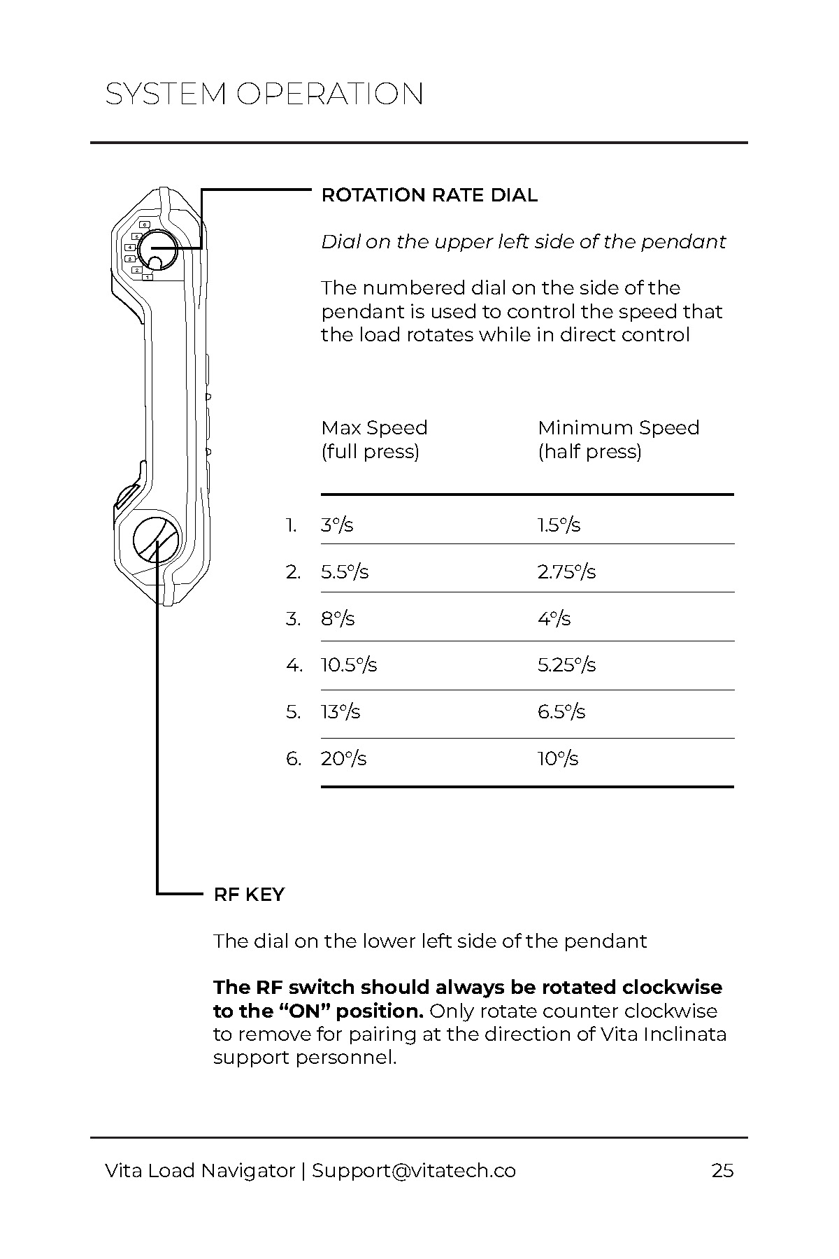
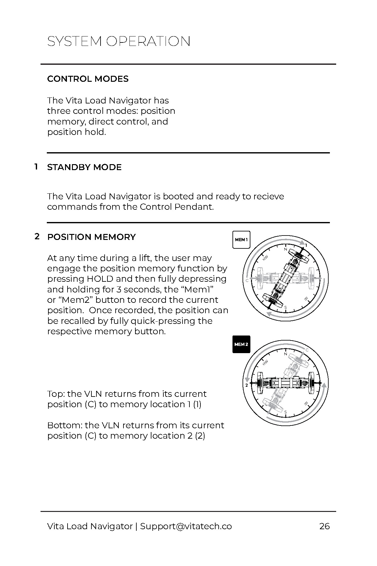
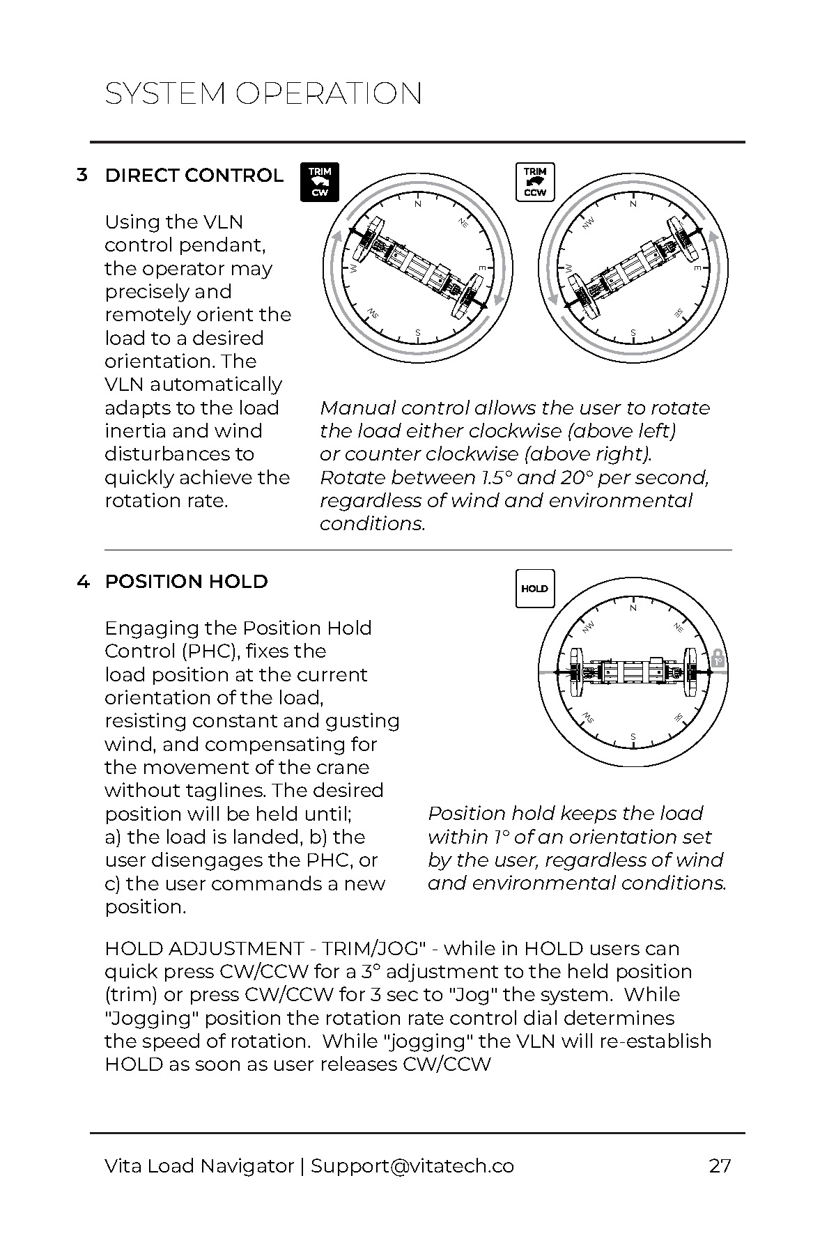
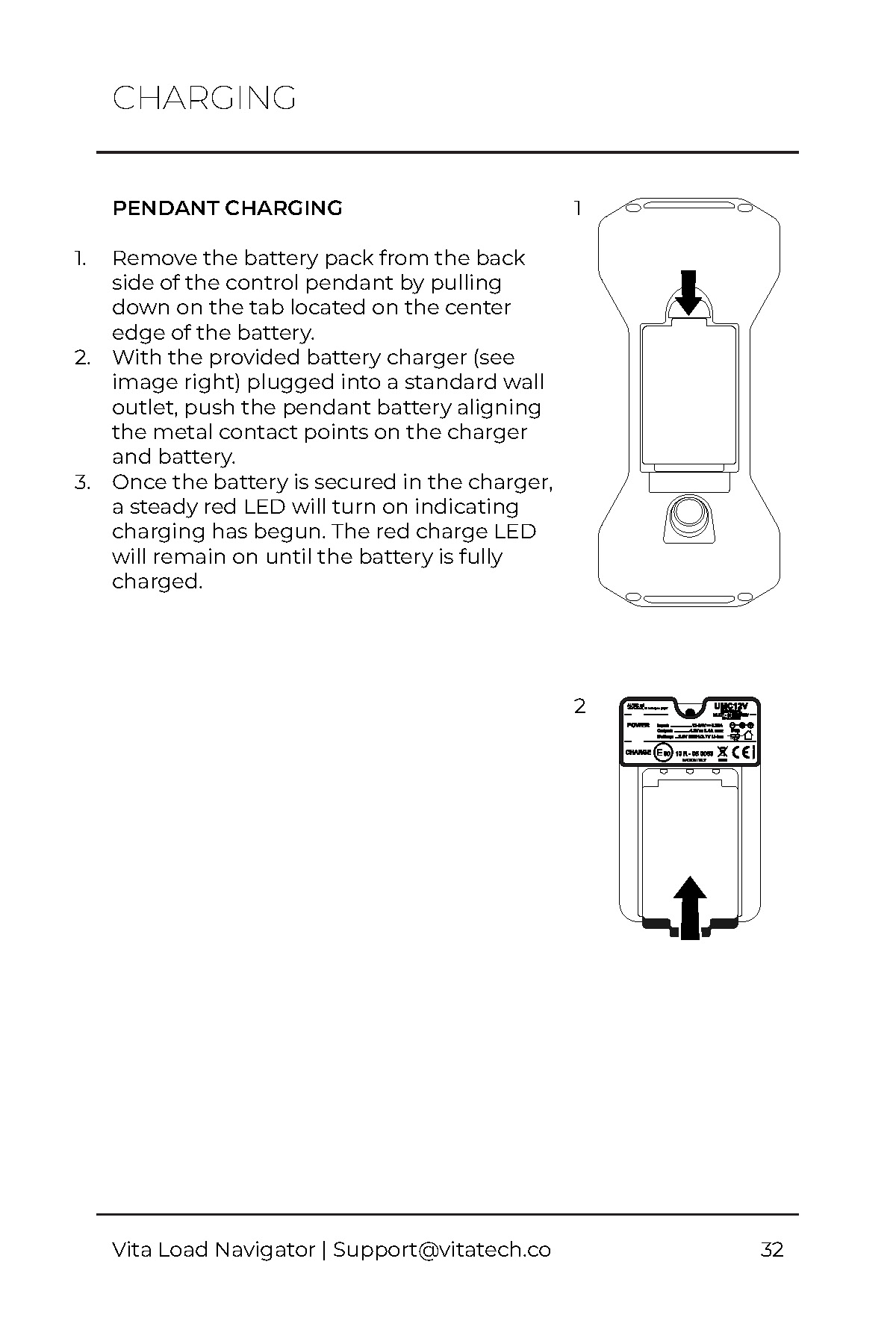
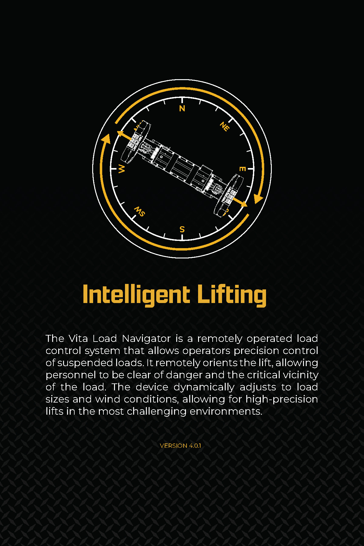
| 2 | There are no diagrams to visualize the pendant functions, so users have difficulty understanding how to use the pendant. | Add top-down diagrams of the system along with a compass to easily understand the pendant functions and the control zones. |
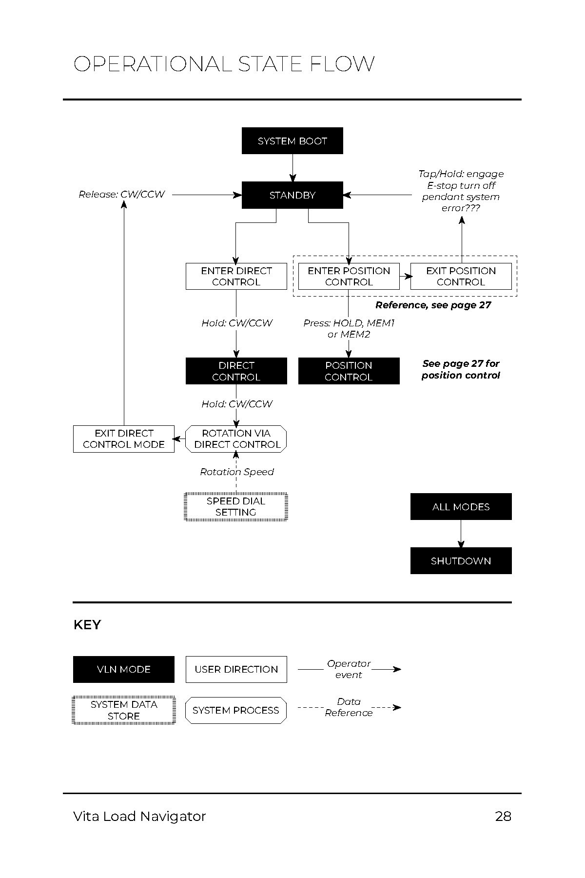
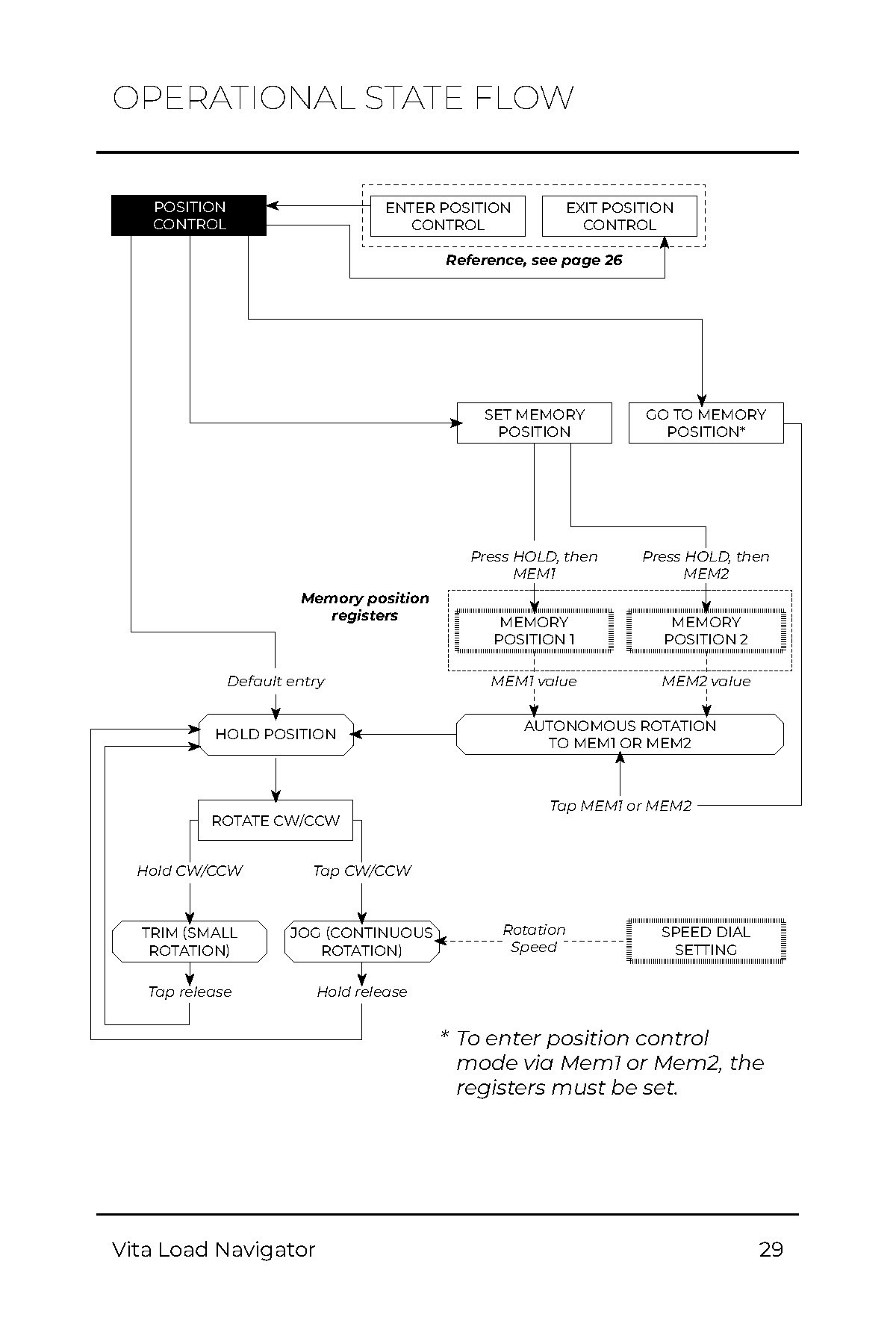
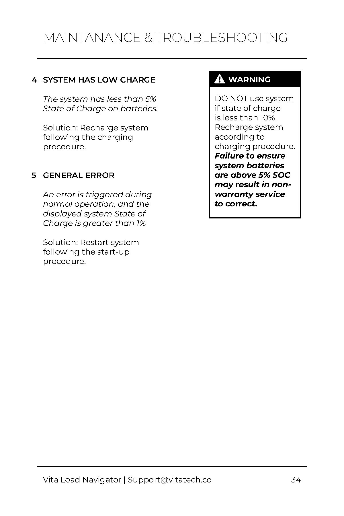
| 3 | There are no visuals to illustrate the state flows of the system, so users have difficulty understanding how the system functions in different scenarios. | Add state flow diagrams to map between different states of the system and the corresponding user interactions. |
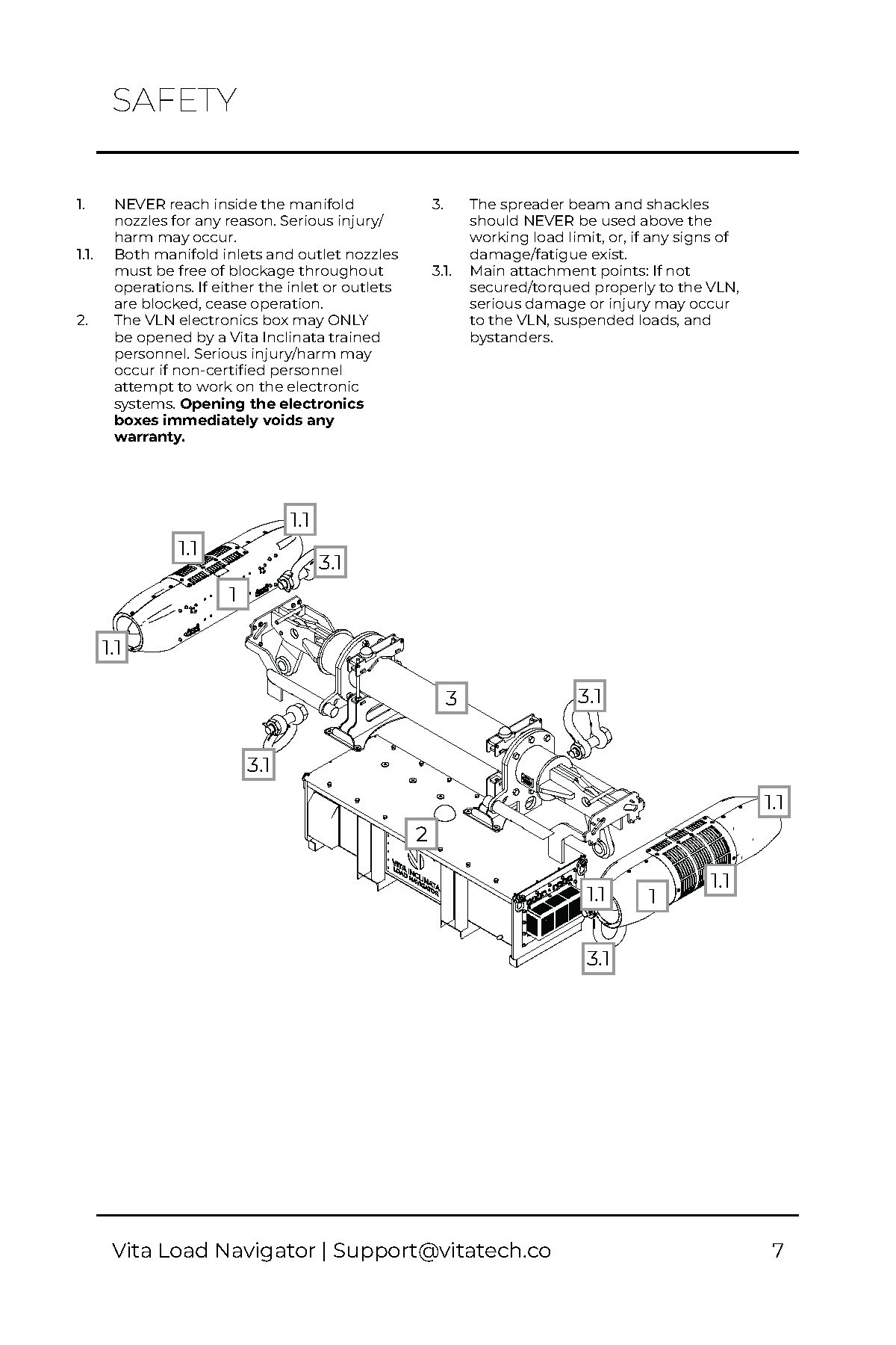
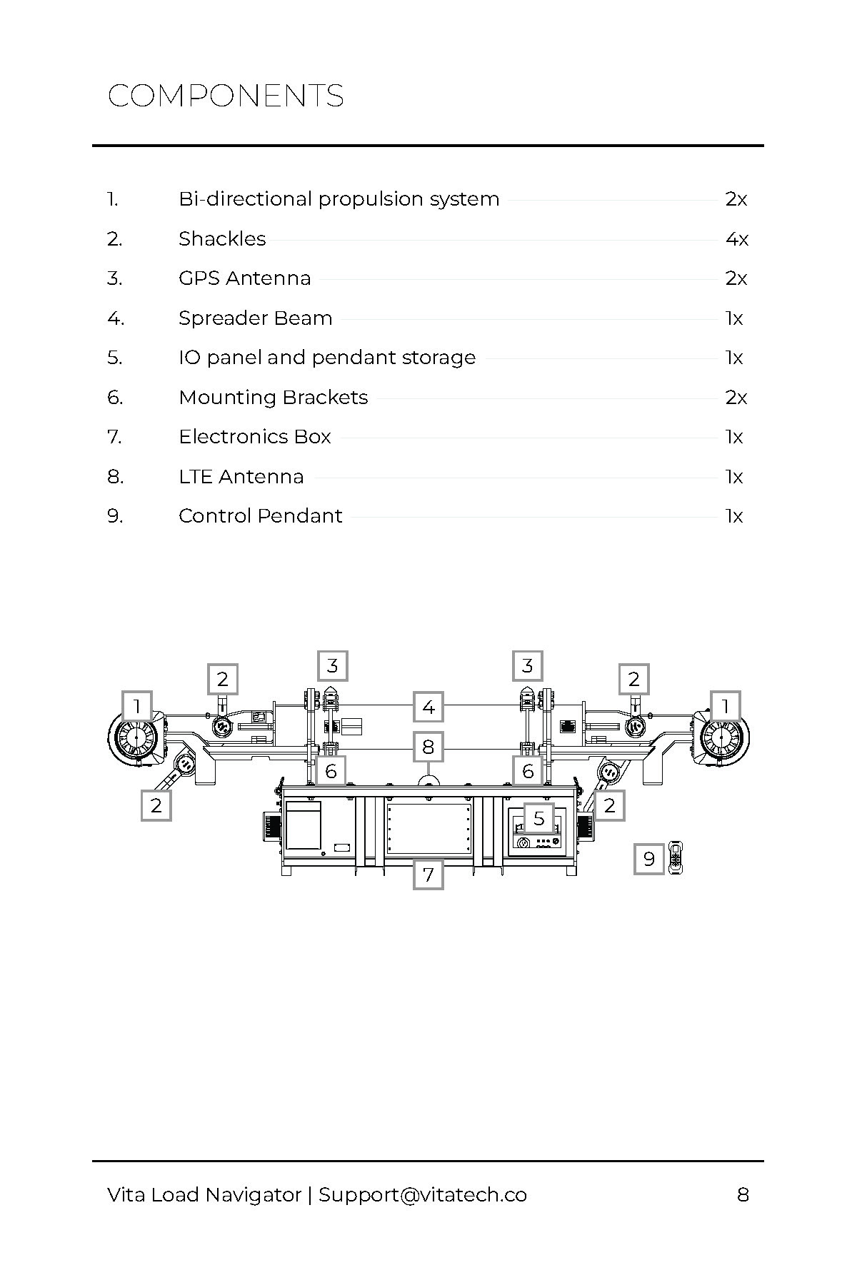
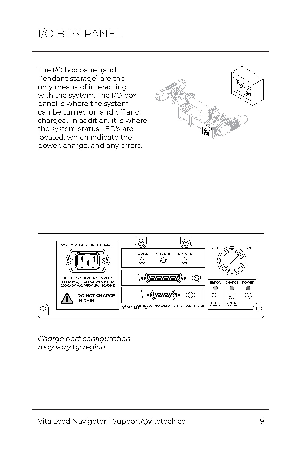
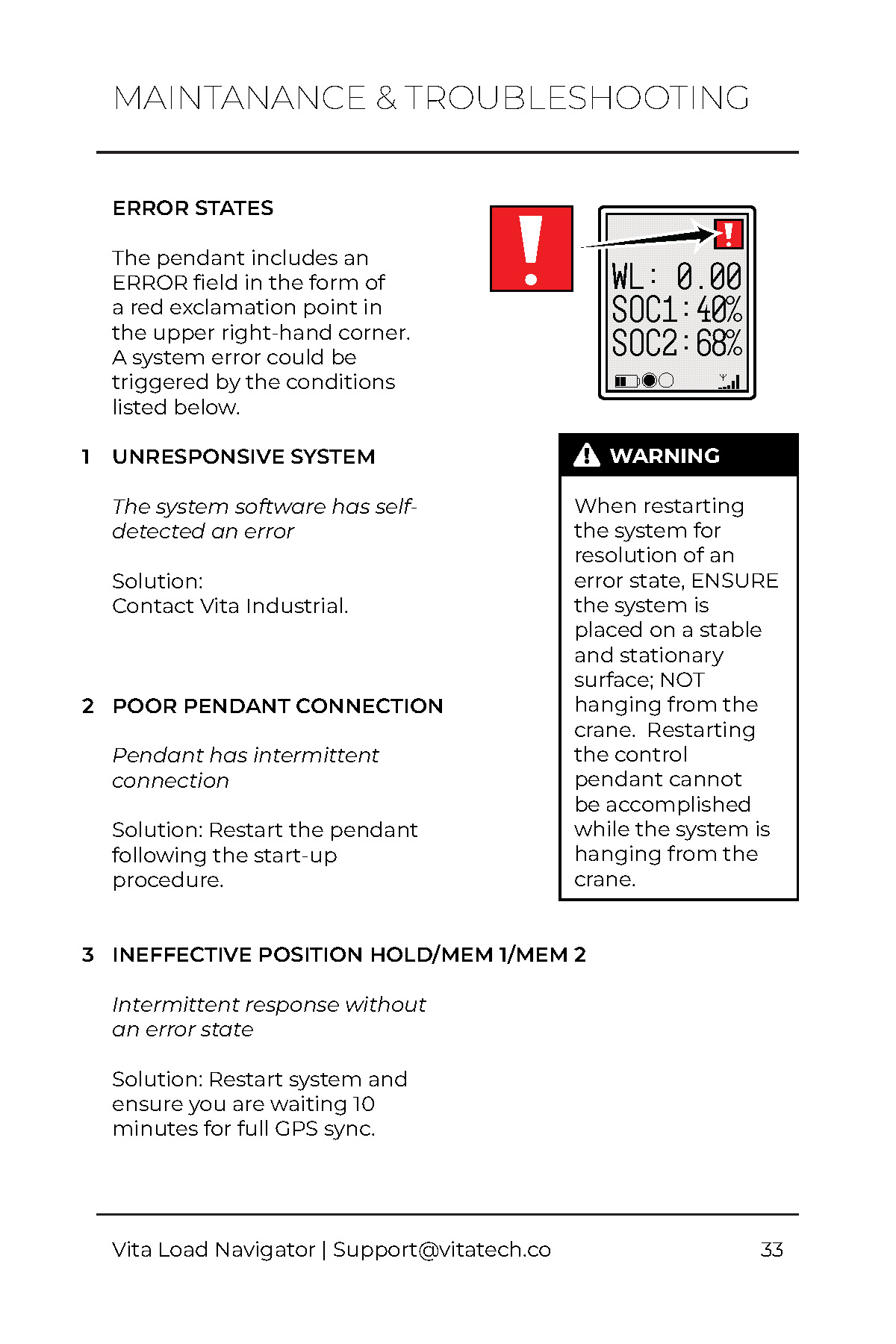
| 4 | Diagrams of the system components are absent. | Utilize line art to clearly denote system components. |
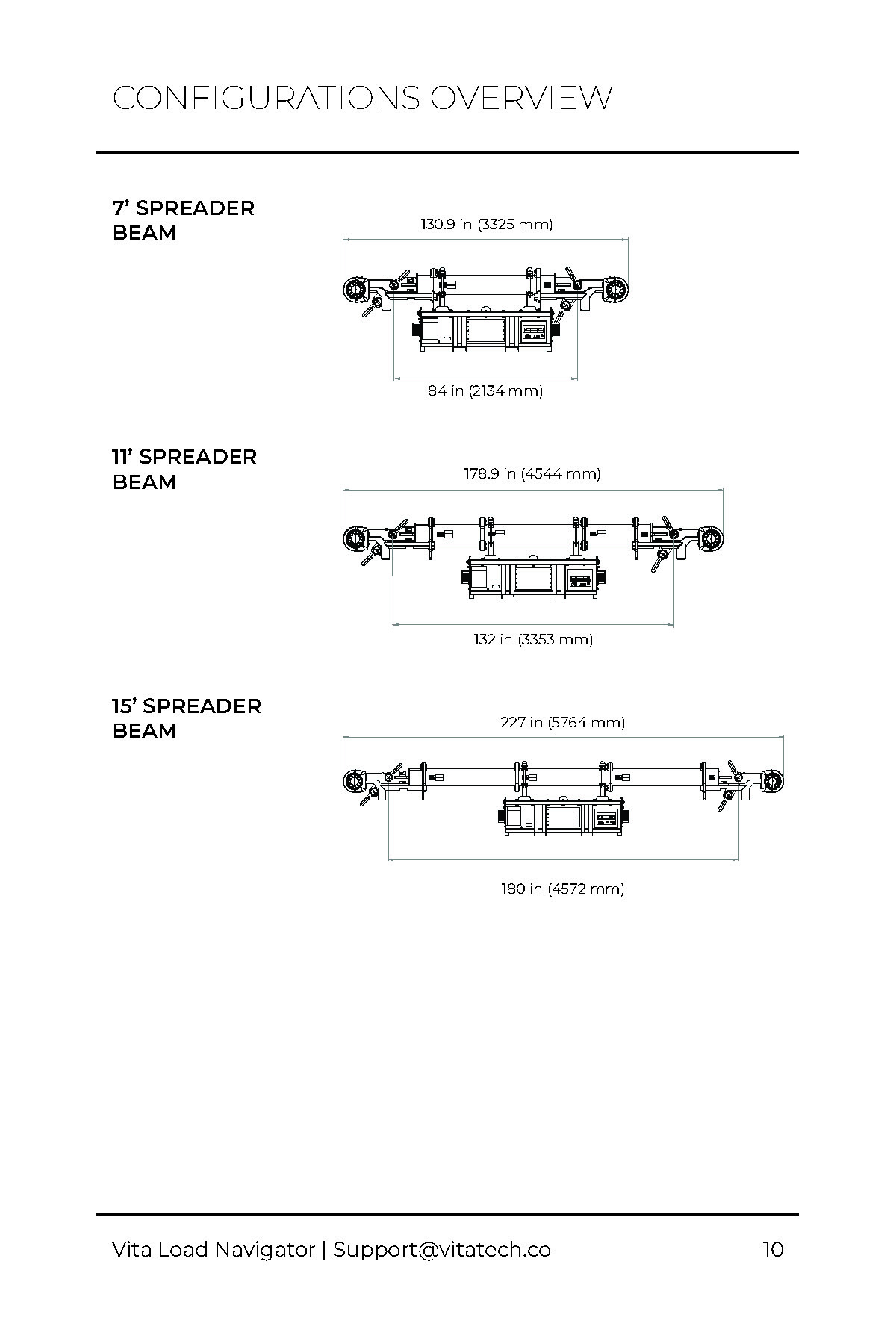
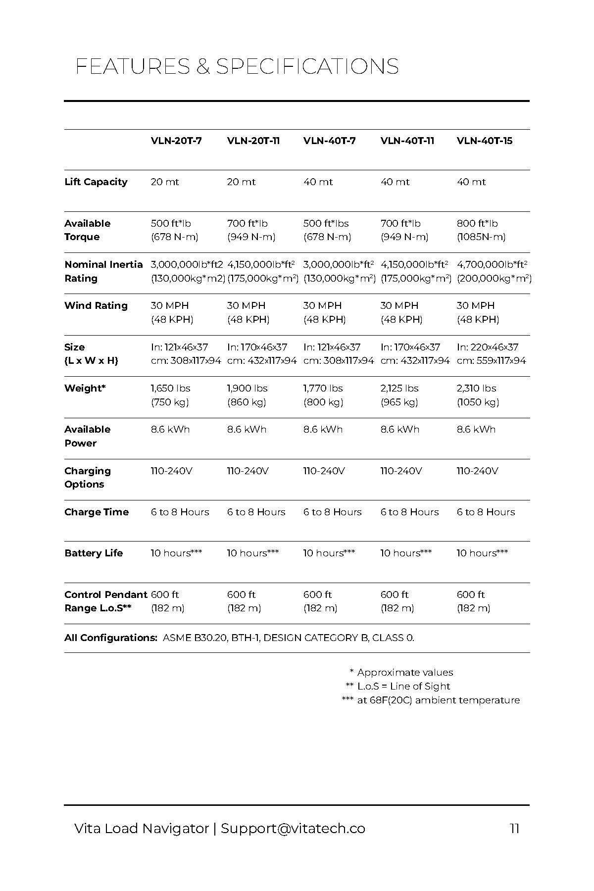
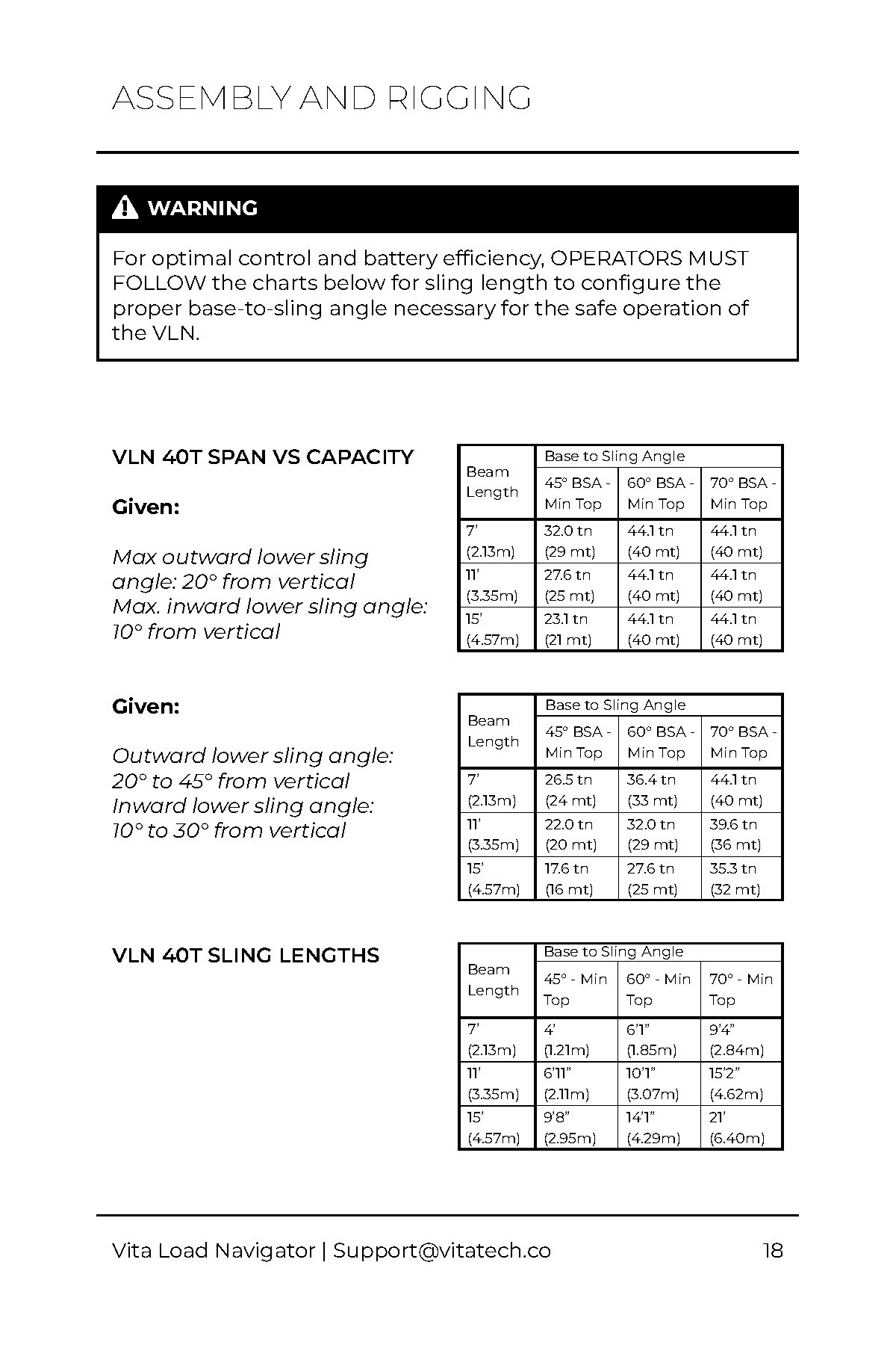
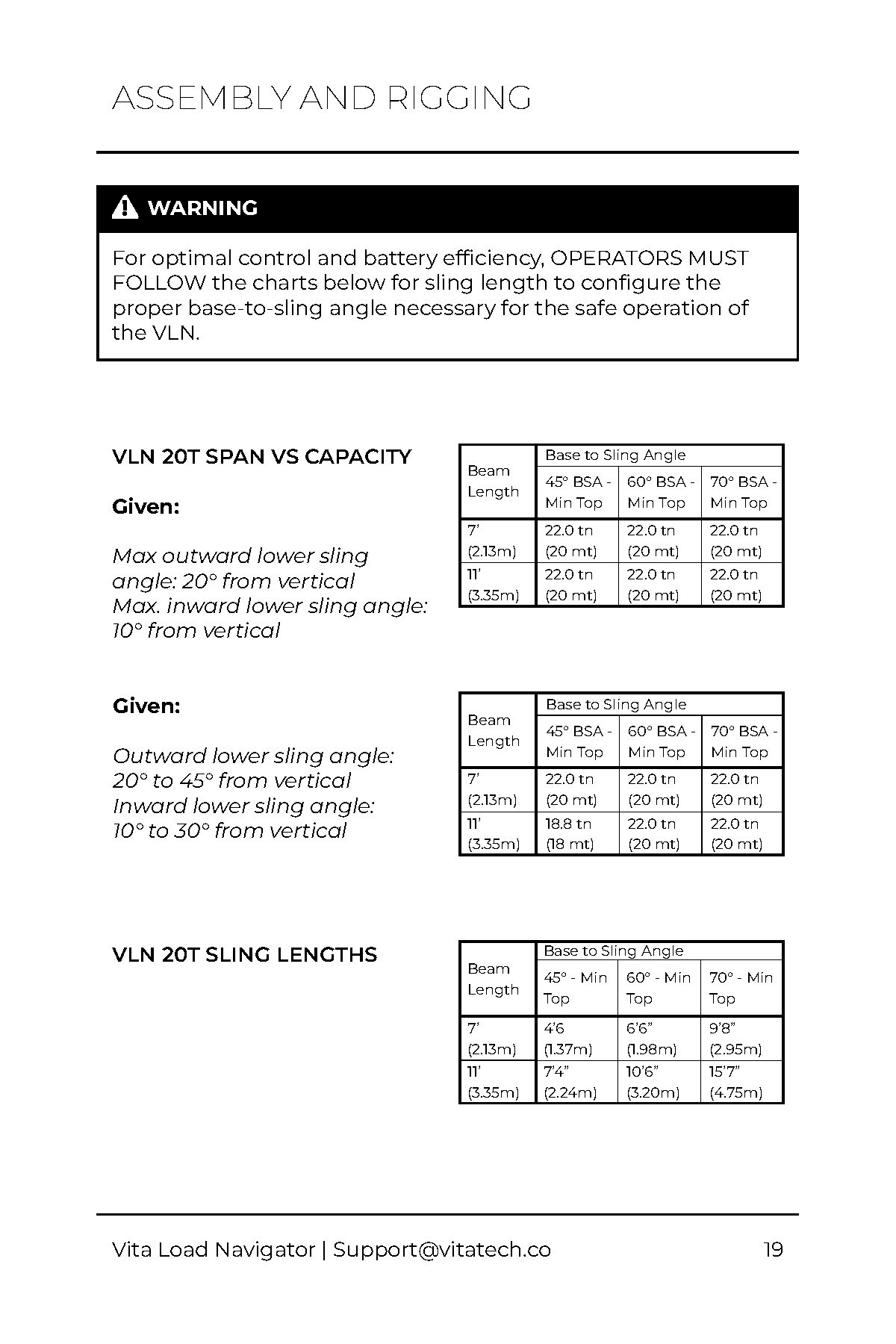
| 5 | There are no visuals to illustrate the features and specifications of the system, so users have difficulty understanding the capabilities. | Show the features and specifications for each model. |
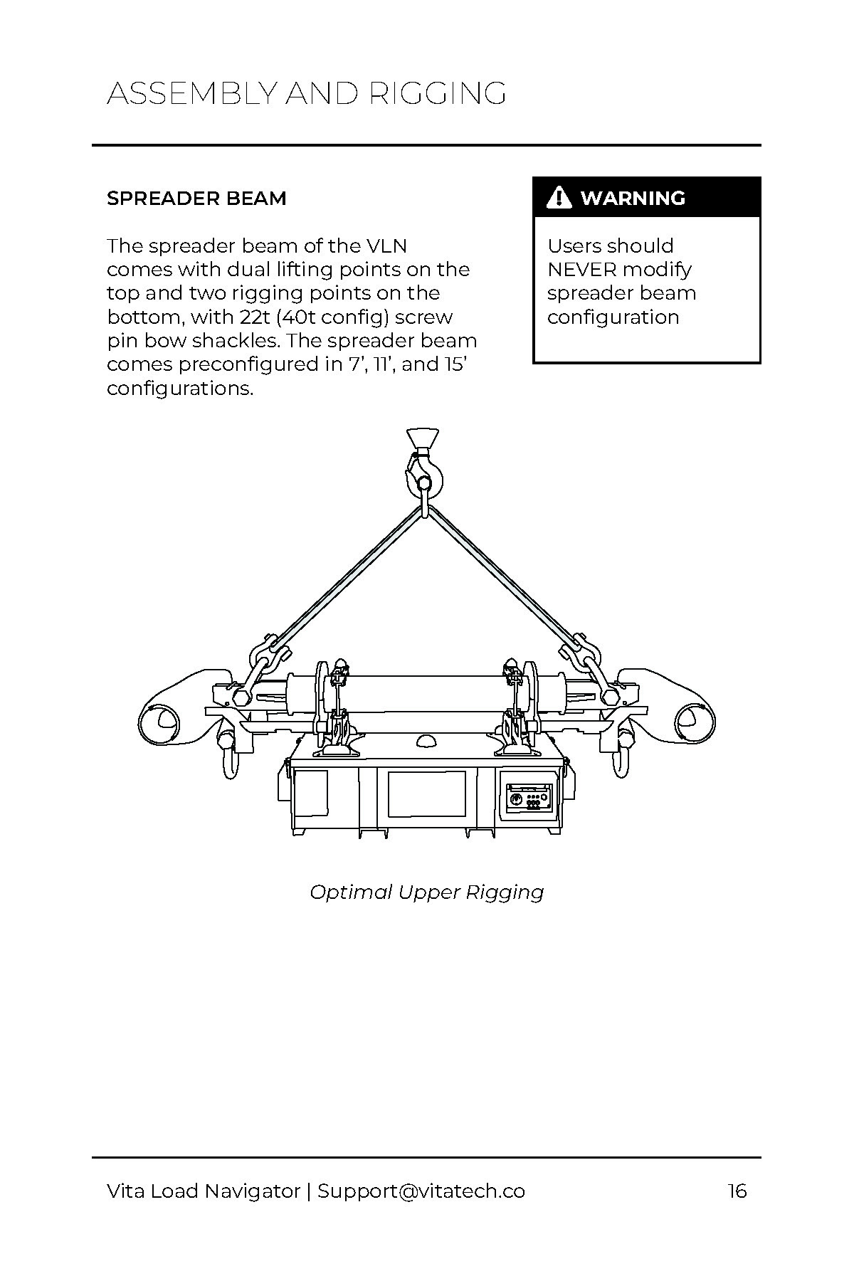
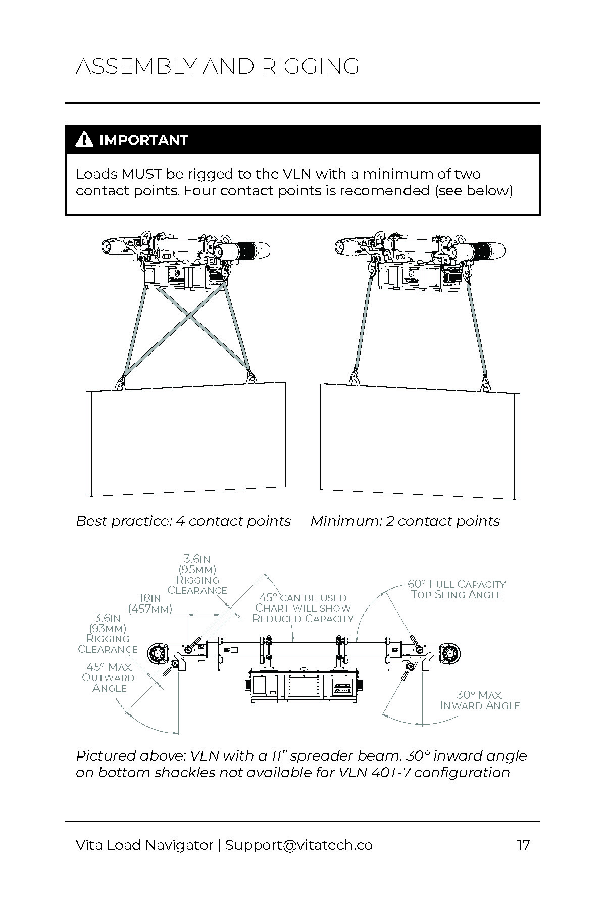
| 6 | There are no visuals to illustrate the assembly and rigging of the system, so users have difficulty understanding how to properly set up the system. | Showcase assembly and rigging. |
-
1
-
2
-
3
-
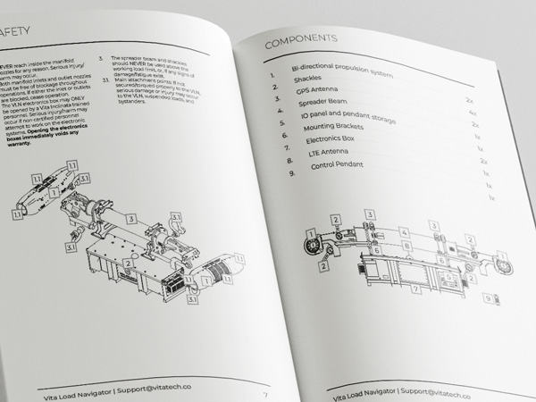
4
-
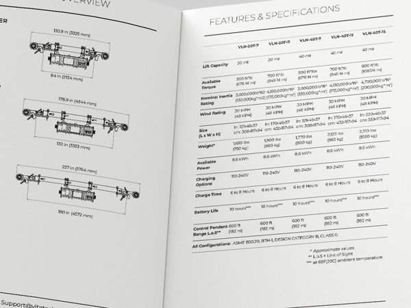
5
-
6
03
Deliverable
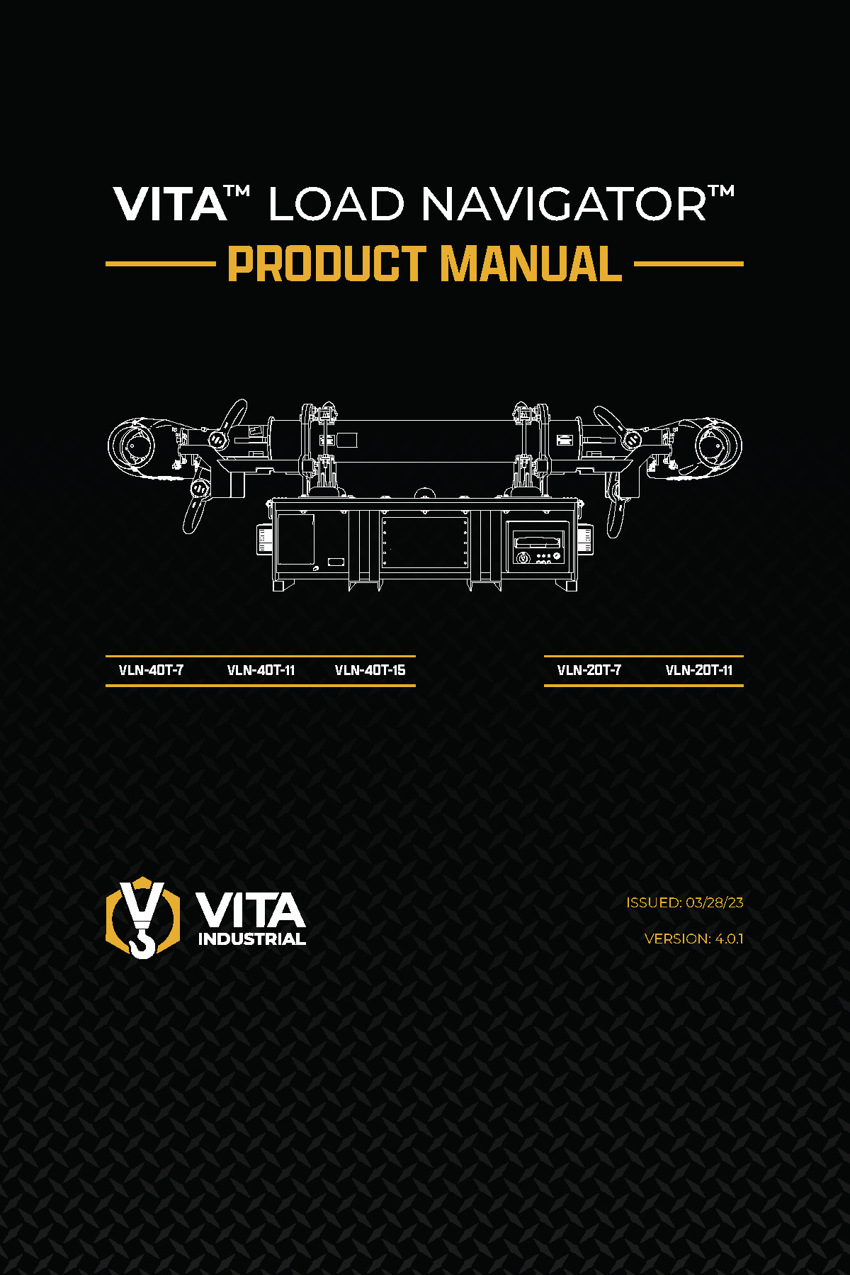
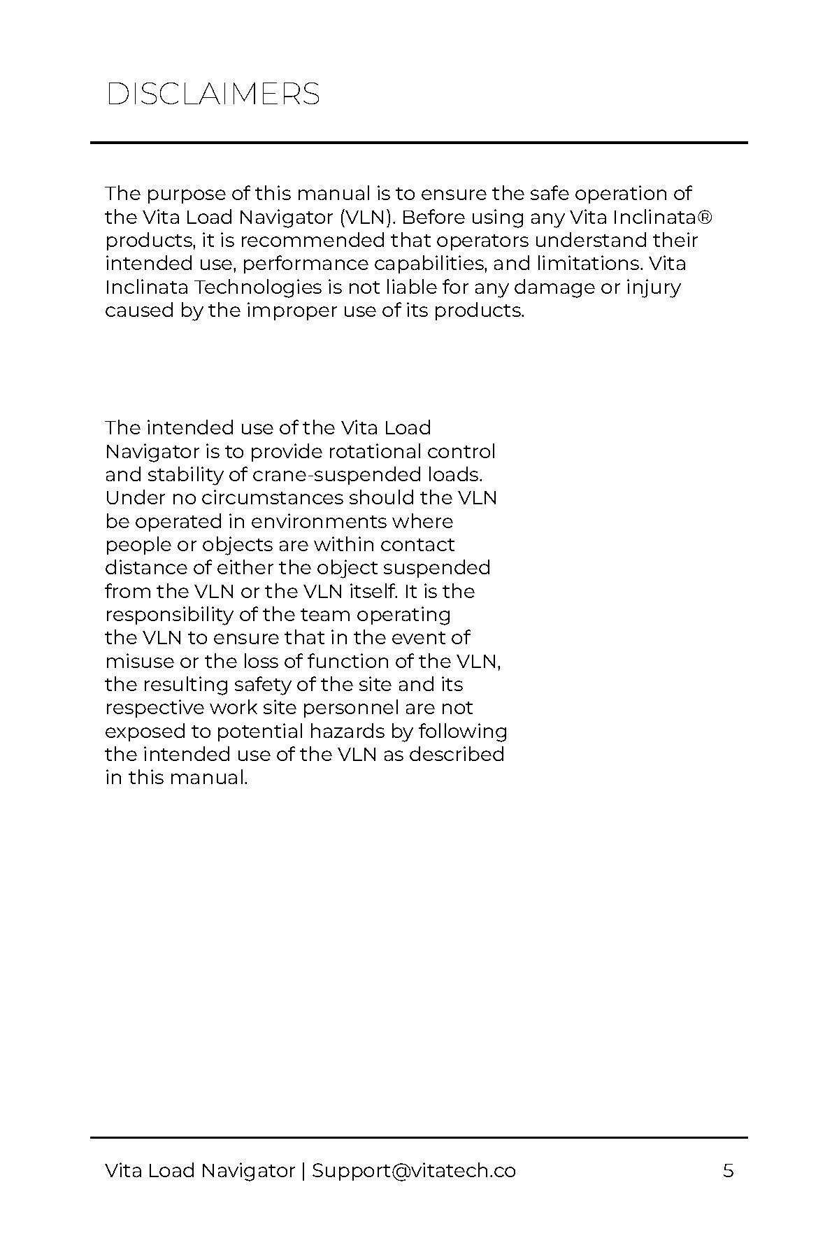
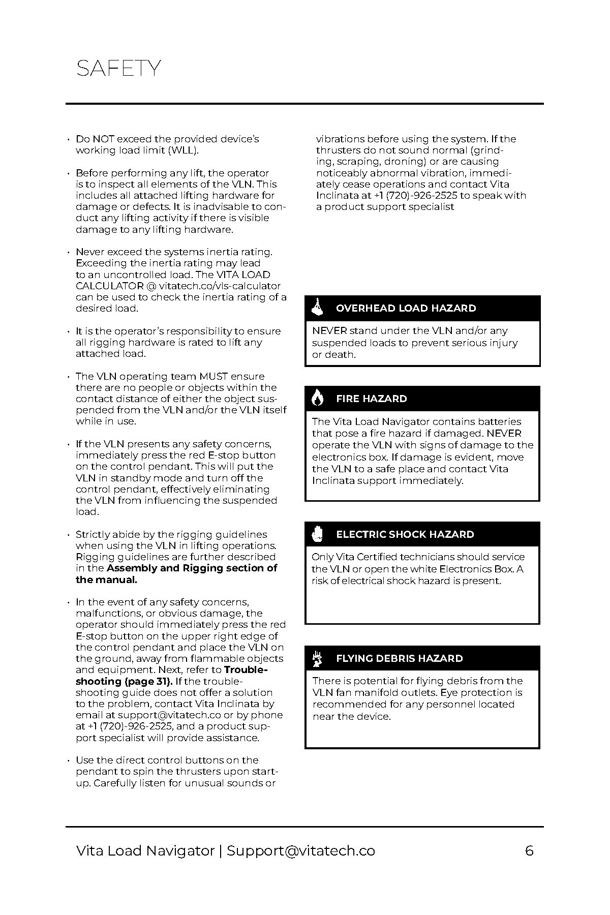
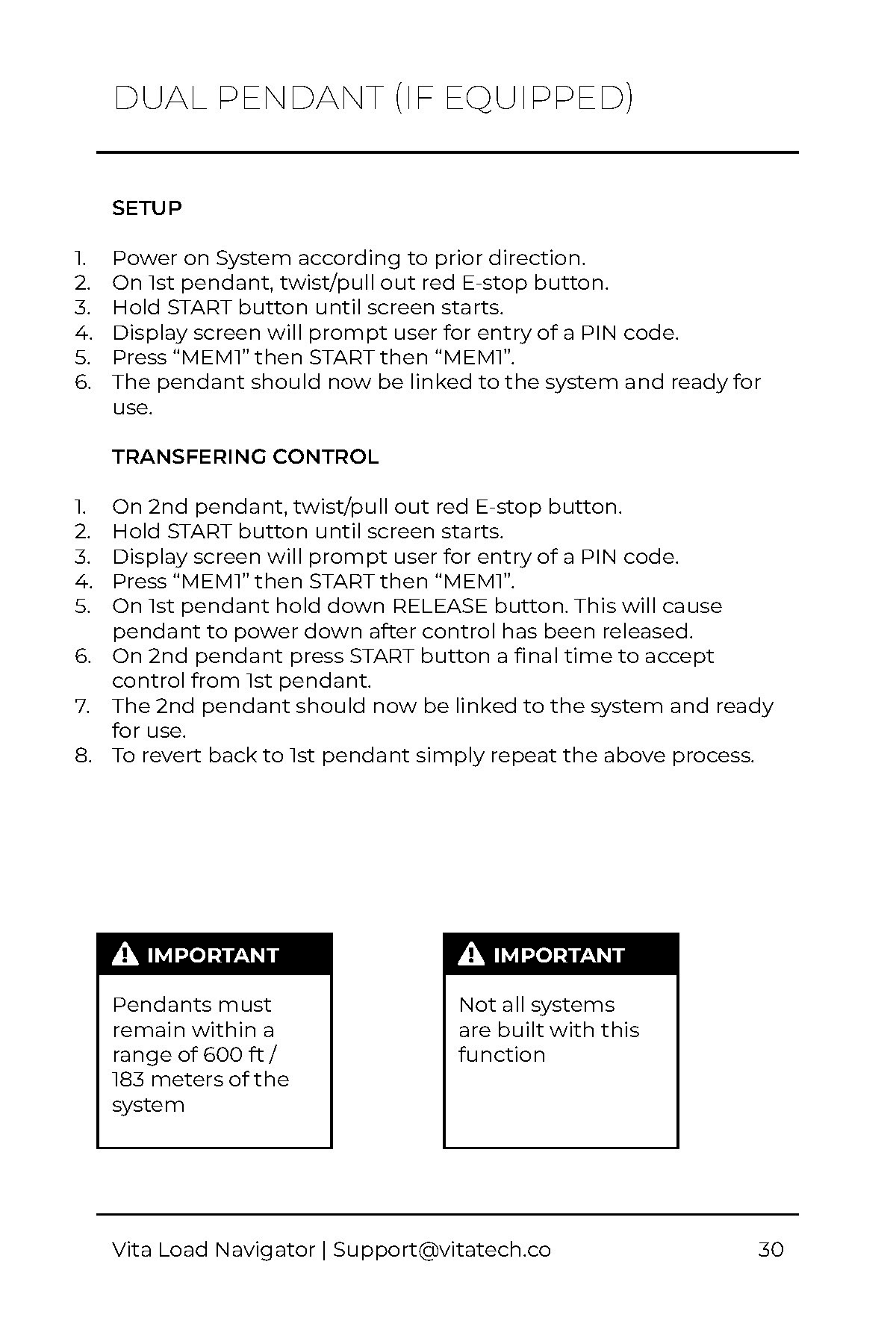
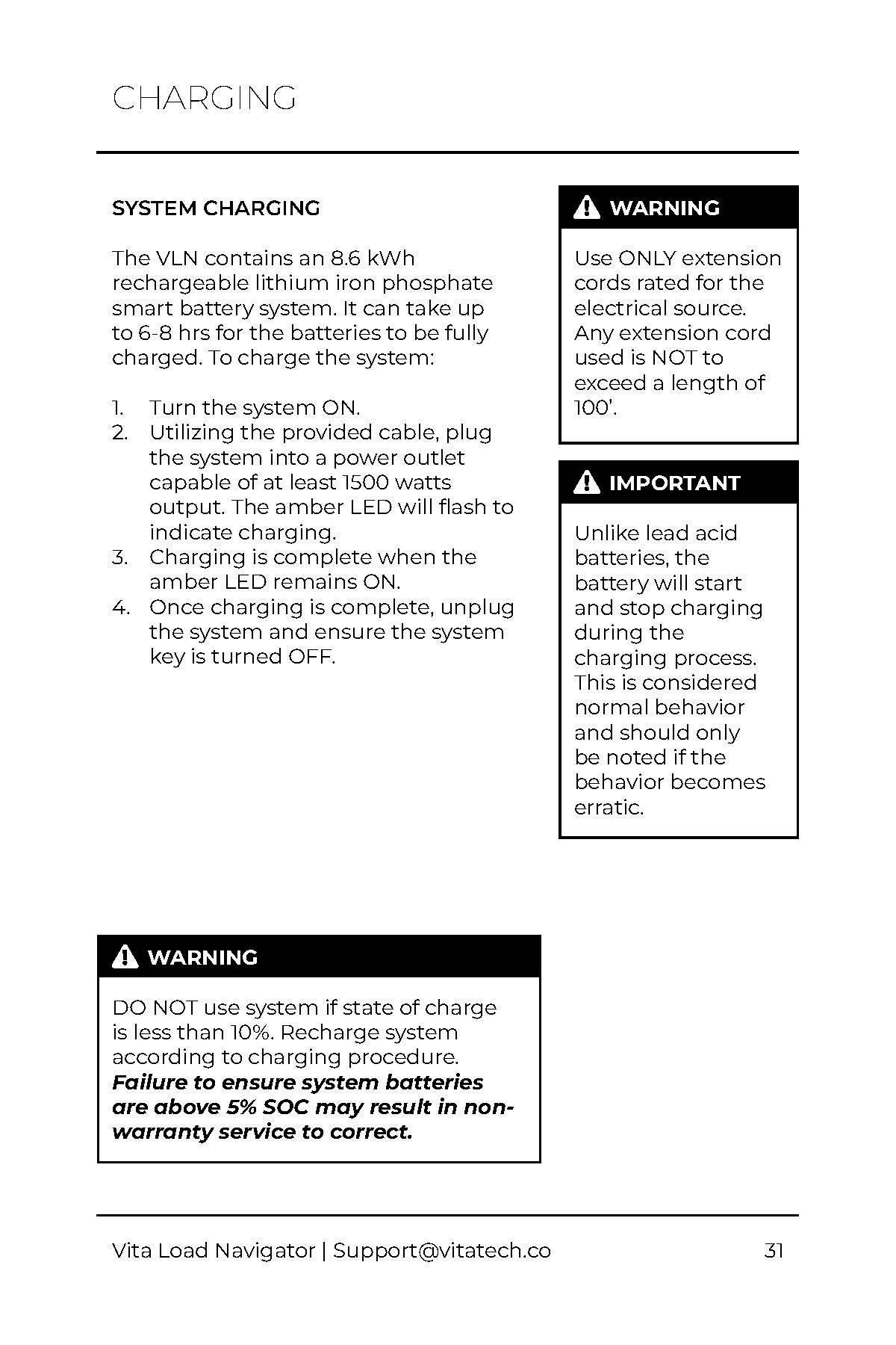
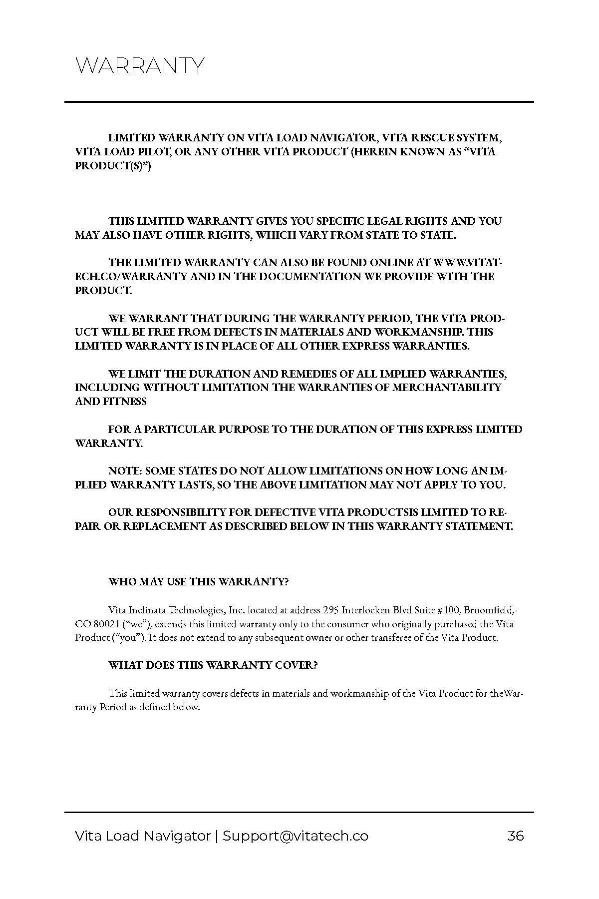
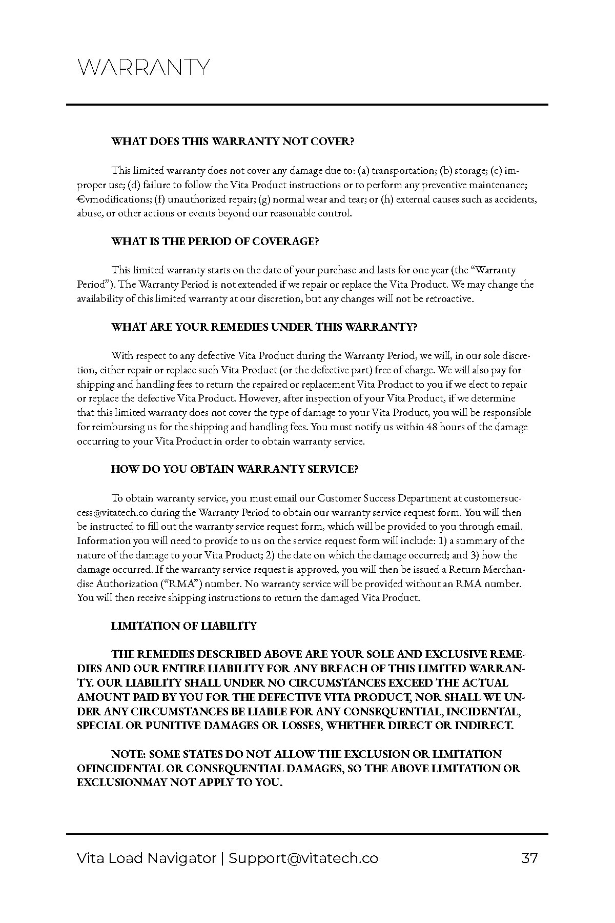
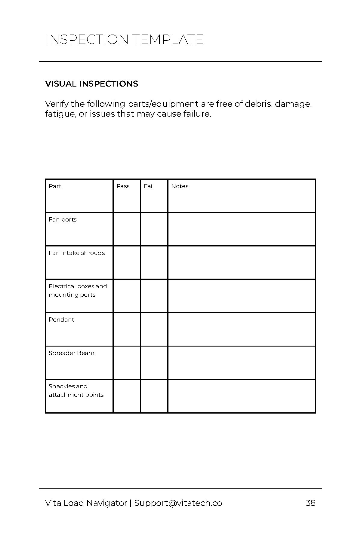
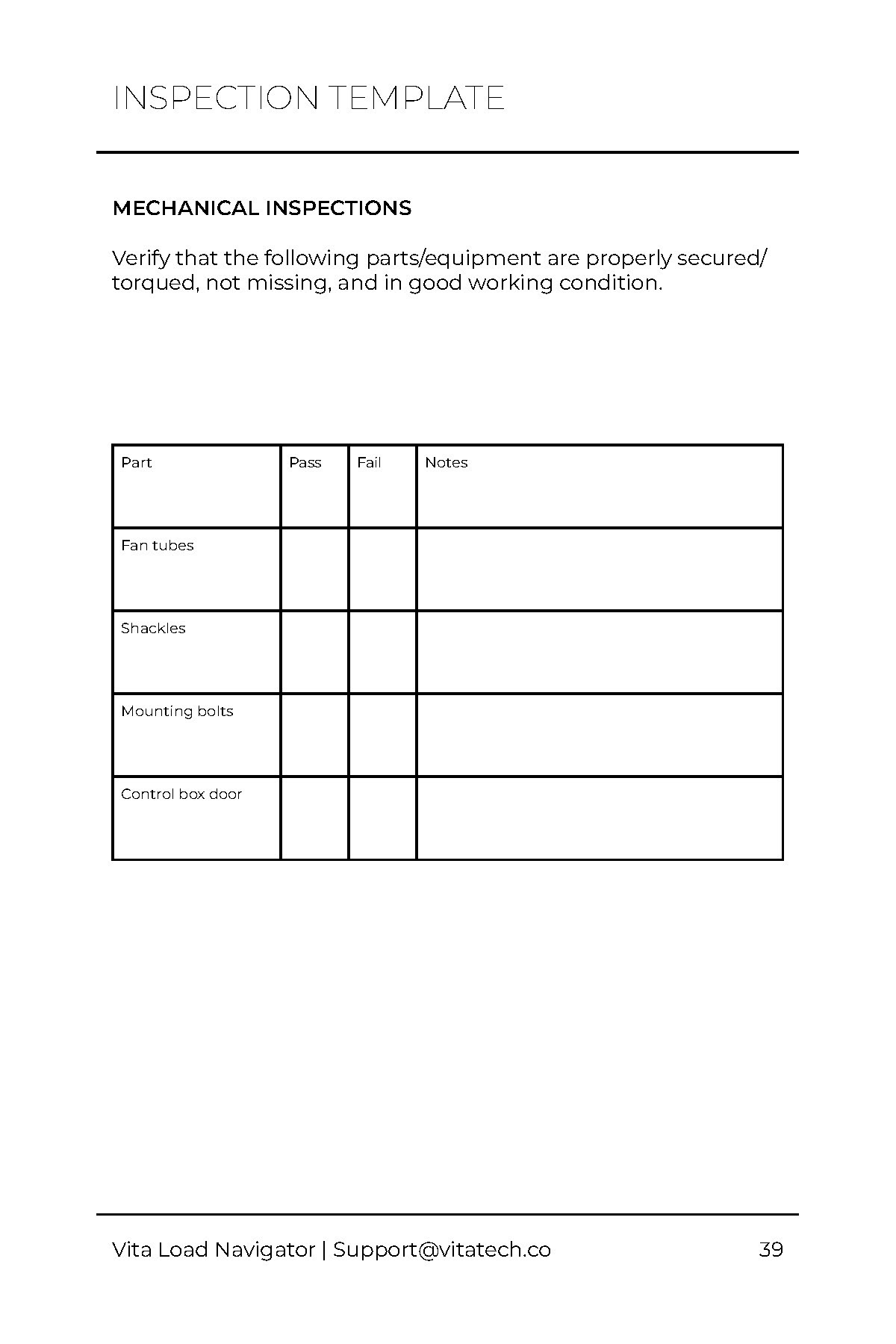
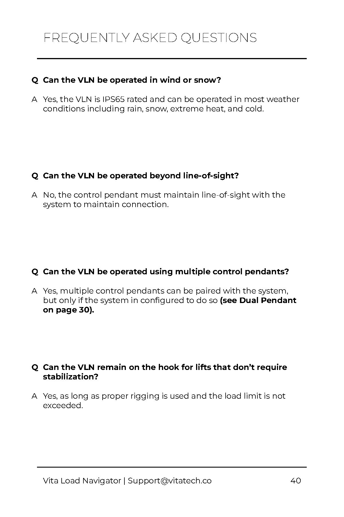
The new product manual received positive feedback internally and externally, with many noting that it was much easier to understand and navigate than the previous manual. The addition of visuals and a table of contents were particularly appreciated.
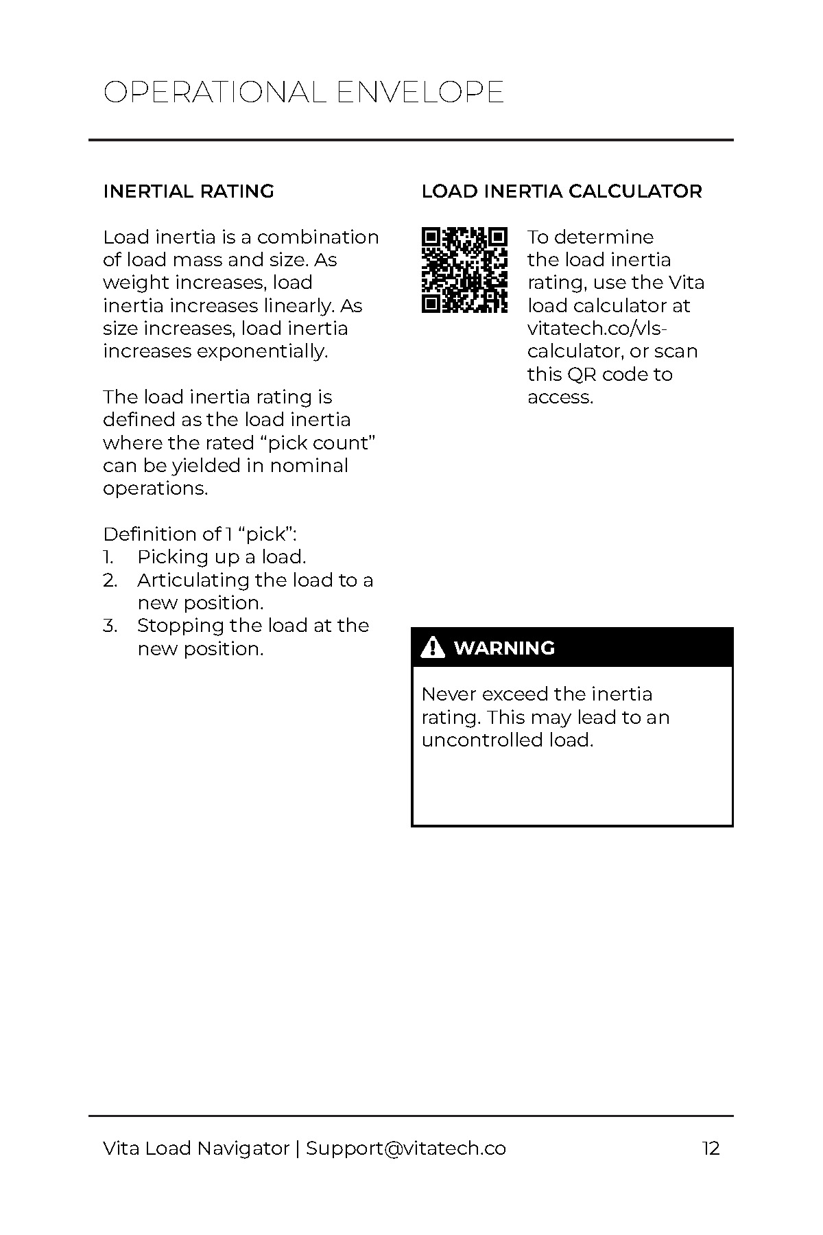
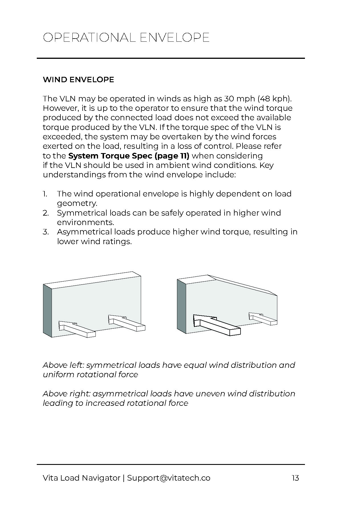
Due to the sensitive nature of the product, some pages have been removed.

More projects
HomeKardia.com path-to-purchase
Optimizing the user journey on kardia.com
Puck Analytics
NHL data pipeline & visualization platform
Breatheasy
An interactive experience for children undergoing anesthesia